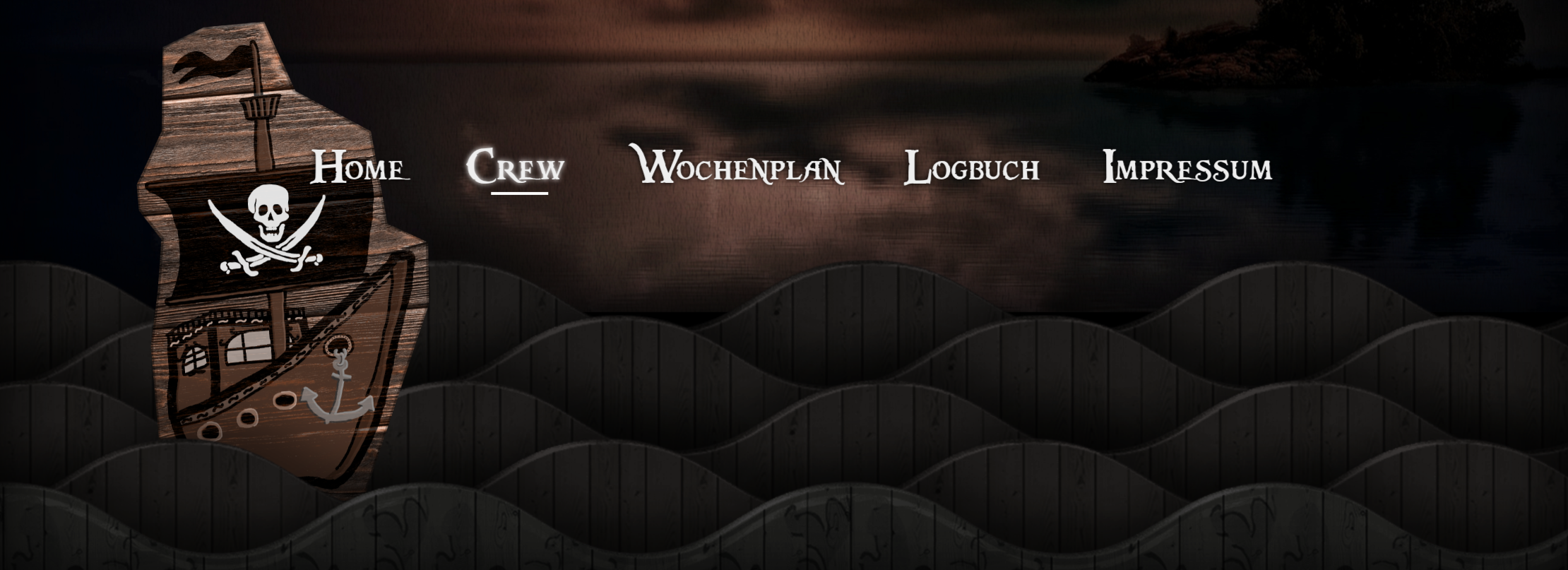
Fig. 1: The cardboard-style rustic header menu in our new website.
I’m involved in the organization of the mathmatics and computer science o-week at the Karlsruhe Institute of Technology. With a bunch of friends, we’re welcoming about one hundred students to the university and to the city, which is still just a small fraction of the new students that come to Karlsruhe each year. We’ve had a simple website for a long time but for this year’s o-week we wanted to ramp up the design, usability and content of the site. Inspired by Matthew Wagerfield’s and Claudio Guglieri’s awesome parallax.js library (and the accompanying site!), I sketched out some ideas for the layout and style of the site:
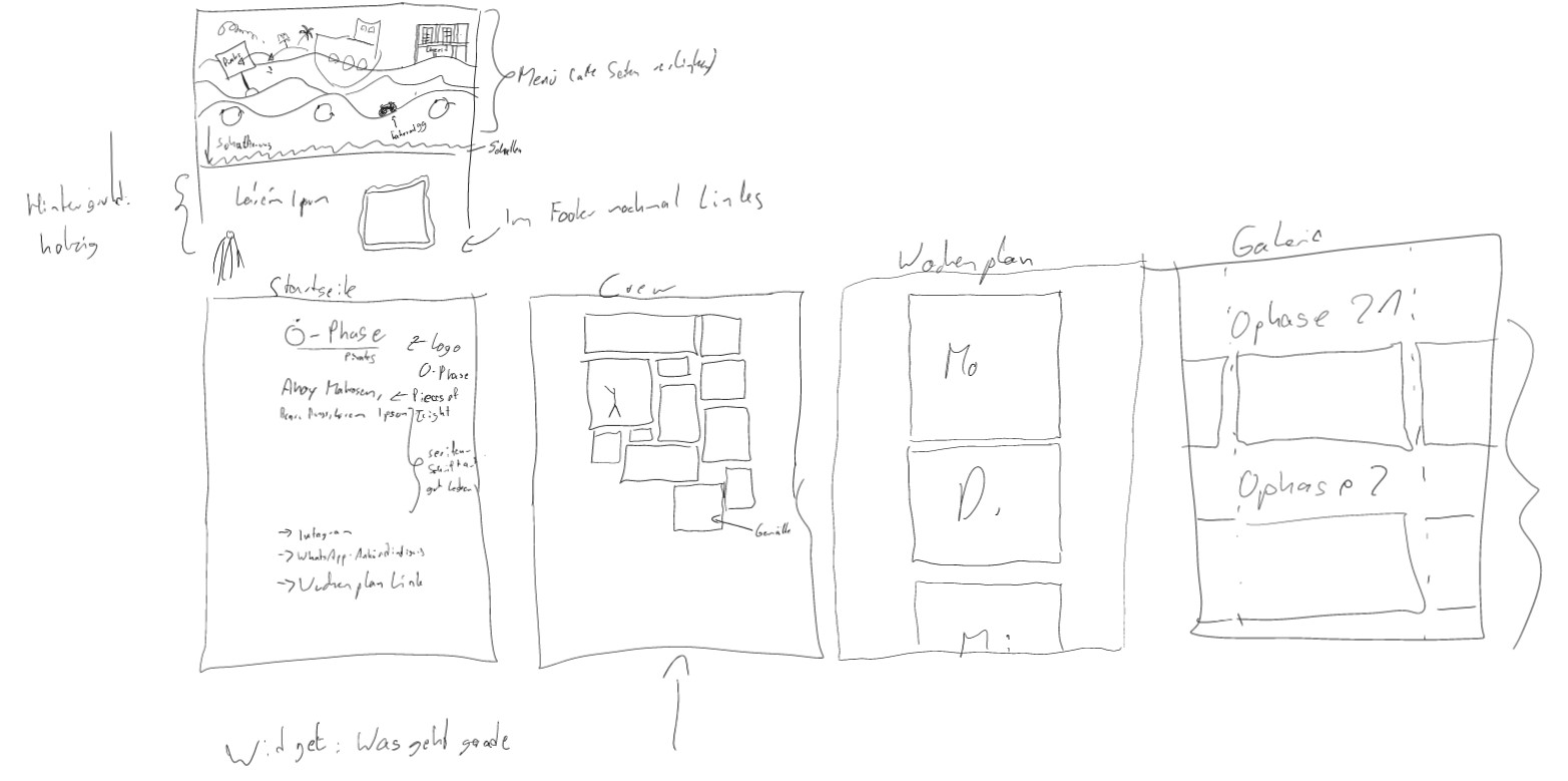
Fig. 2: An early sketch of several layout components such as the header
menu and the mosaic crew page.
Together with my friend and co-organizer Philipp, we refined the idea and implemented it within three days (!). We used a lot of free photos and vector images from the internet and Philipp created some awesome musty, pirate-y and wooden artwork that we could use. I’m really happy with how it turned out, you should definitely…